
When you’re running a PPC advertising campaign, you want to maximize your return on investment.
However, it’s not just the ads themselves you should be thinking about. You have to think about landing page optimization (LPO), as well.
In this post, we’re going to show you 12 landing page tweaks and tests you can use to improve your PPC conversion rate.
Let’s take a look!
1. Improve your conversion rate by including a pricing table
If you have a product that has different pricing plans, make sure you include a pricing table on your landing page.
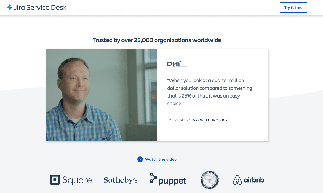
For example, our client UpContent improved conversion rate by 7.51%. We made one tweak to the landing page by adding a pricing table shown below.
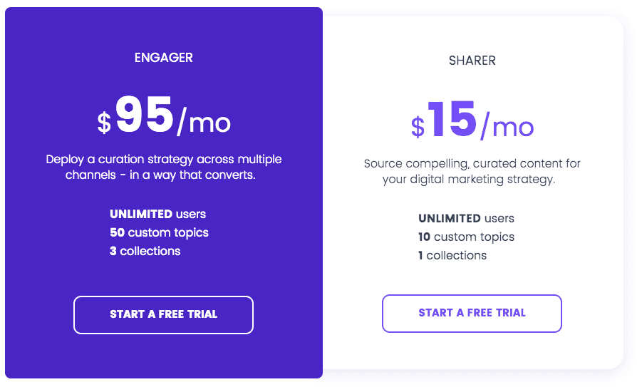
We added this exact pricing table to the landing page, which resulted in a 7.51% increase in conversion.
Why?
Well, when a visitor lands on your landing page from a PPC ad, they will become convinced to buy your product or subscribe to your service.
However, if there’s no transparent pricing outlined on the landing page, they’re forced to go searching.
Every time a lead navigates away from your landing page, you risk losing them as a paying customer.
If you integrate a pricing table into your landing page, you’ll be giving them all the information they need to sign up.
CRO Takeaway: Include a pricing table if your product or service has different pricing plans.
2. Reinforce intent with headings and keywords
The headings on your landing page have to match with the keyword ad group you’re targeting.
For example, you could be running a PPC ad for “analytics software.”
When your lead clicks on an ad promising them great software for small business owners, they have to land on a landing page that promises the same.
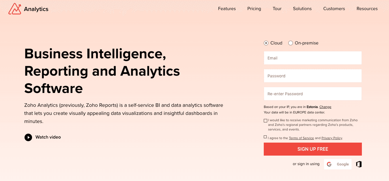
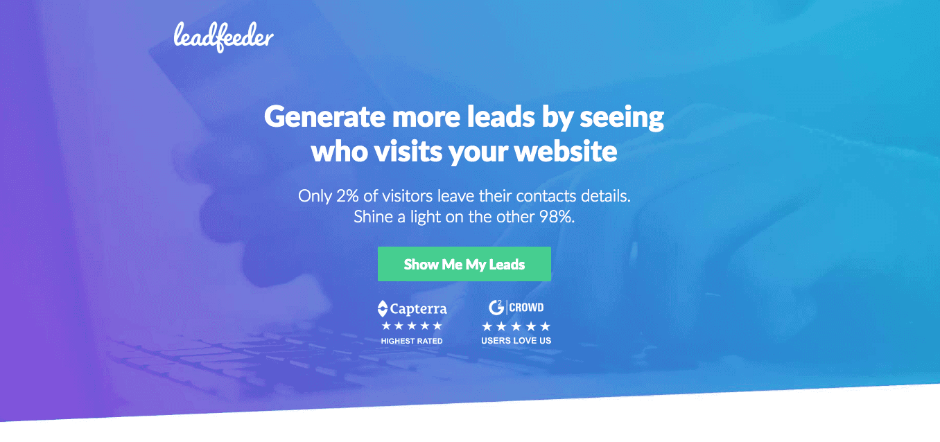
Here is an excellent example from Zoho.
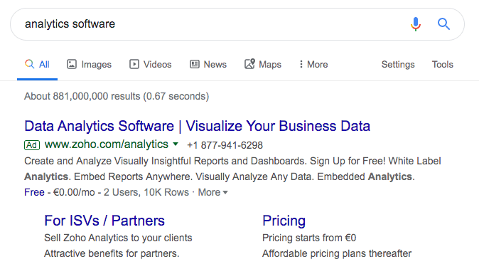
The keyword ‘Analytics Software’ is mentioned in the ad and landing page headings.
Use your landing page headings to reinforce the lead’s intent.
Remind them why they came to your site, and what you can offer them.
Typically, you don’t have to write meandering copy to get there. Your customers already know.
All you need to do is remind them by using the same keywords they’ve used in a search that led them to your company.
CRO Takeaway: Repeat the ad keywords in your landing page headings.
3. Long live (Relevant) live chat!
Live chat works wonders for conversion rate optimization. In fact, it increases online leads by 40% on average, likely because 79% of consumers love using it.
And while your garden variety live chat will do, your conversion rate will skyrocket if you personalize it.
Make your live chat box relevant to the keyword group of every lead on your landing page.
This way, you won’t be asking them generic questions.
You’ll be taking their entire customer journey in stride, matching their intent, and offering additional value that drives conversions.
Personalization is key.
Intercom uses personalization in this pop-up on their customer support landing page:
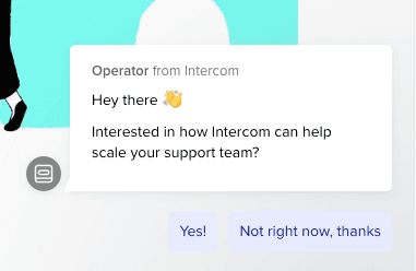
It matches the intent of the page, customer support, and asks a relevant question.
Your leads will develop trust and convert at much higher rates when they can see that your company wants to help them make the best choice for their unique needs.
CRO Takeaway: Make your landing page live chat relevant by tracking information about the keyword ad group they came from. Ask a question or provide value in relation to that specific keyword ad group.
4. Add customer testimonials to your landing page
At this point, your lead knows that you’ve got the product they need. They’ve seen your ad and clicked through.
Now’s the time to convince them.
A part of that process includes showing that you’re a reputable company that has helped people just like them.
Customer testimonials are a great way to improve your landing page conversion rate.
Customer profiles displayed on the landing page should be as similar as possible to the leads you are targeting:
Pull their quotes on specific (and relatable) problems they’ve solved with your product
Include quantitative data whenever possible (e.g. “XYZ Email helped us increase our email conversion rate by 55%”)
Use names, photos or logos
For example, if you’re targeting keyword ad groups small biz owners use, make sure you place testimonials from your small biz customers on your landing page. When targeting enterprises, use logos of well-known companies.
CRO Takeaway: Customer testimonials will significantly improve your conversion rate. Don’t be afraid to use them.
5. Too much information? Try using your CTA
Landing pages are often so bogged down by different information and elements that leads forget why they came in the first place. They distract your potential customers from doing what you want them to do:
Buy or sign up for your product or service.
Try removing navigation bars (headers and footers) from your landing page. Keep the page strictly focused on the call to action.
As a general rule of thumb, your landing page should be 100% intent-focused.
If you want your leads to subscribe to your newsletter, your copy and your landing page design should be oriented on motivating them to do just that.
However, sometimes even headers and footers can be distracting.
CRO Takeaway: Experiment with removing navigation bars from your landing pages, and only directing to CTAs so you remove all the distractions.
Ready to turn PPC into a channel leadership trusts?
Book a call
6. Experiment with exit intent pop-ups on your landing pages
Leads can leave your landing page for a variety of reasons; distraction, boredom, lack of concentration.
But when you trigger a popup that reminds them of what they’d be missing if they left, they’ll reconsider.
Pop-ups’ visual nature makes sure of it, and your exit offer drives the point home.
Use exit-intent pop-ups.
However, make sure the pop-up is tailored to the keyword ad group you’re targeting.
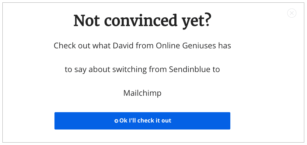
Sendinblue push traffic to a landing page comparing Mailchimp and Sendinblue. When you go to exit the landing page, this pop-up covers the whole page. The pop-up targets the exact keyword and could make people convert.
The more relevant your pop-ups are, the higher your conversion rate will be.
CRO Takeaways: Exit intent pop-ups are the best pop-ups there are. Make sure you add them to your landing pages to recapture the leads you would’ve frequently lost.
7. Turn lead forms into lead qualifying forms
Think about a typical lead form: it only asks for a lead’s name and email address.
Doesn’t give you plenty to go on when it comes to understanding your potential customers, does it?
Now, the majority of landing pages contain only simplified email collection forms for a reason: getting a higher conversion rate.
Simplified lead forms can impair the quality of your leads and conversions in the long term.
You spend your time and money on leads, so you have to make sure they are worth it.
Add additional qualifying questions to your lead gen forms on landing pages instead of necessary email collection, and consider using Calendly, as well.
The better the quality of leads that enter your funnel, the higher your revenue and ROI will be.
CRO Takeaway: Consider adding additional lead qualifying questions to your standard forms. You may not have such a high conversion rate, but you’ll improve the quality of it.
8. Create mobile-friendly landing pages
Over 50% of total searches are now coming from mobile. And when we’re talking phones, we’re talking phone constraints:
Leads don’t navigate with a computer mouse; they navigate with their fingers
Only a portion of your landing page will be visible before leads have to scroll
Leads are not prepared to go through huge chunks of text or wait for additional elements to load
It’s time to create mobile-friendly landing pages.
Mobile-friendly landing pages have to be simple and easy to navigate:
Create significant and clear CTA buttons
Write short lines and paragraphs with plenty of white space
Place the most essential content and offers above the fold
Avoid any unnecessary elements! Speed is crucial to improving landing page conversion rates.
You can test your landing page’s mobile-friendliness with Google’s Mobile Friendly Test or our favorite Pingdom Tools.
CRO Takeaway: Make mobile-friendly landing pages, or at least create responsive landing pages that adapt to different devices.
9. A/B test your way to landing page optimization
Landing pages are hardly ever perfectly optimized on the first try.
This is why it’s important to test them against one another continually (A/B test), measure lead responses, and tweak your way to perfection.
You can test just about anything:
Copy
Visuals and other elements
Offers
Design
Targeting
When you’re A/B testing, make sure you test only one thing at a time.
For example, you could test landing page design, comparing a simple landing page against an in-depth landing page. Then, once that’s done, test something else, but never test two variables at the same time.
You won’t know where your results came from.
CRO Takeaway: A/B test your landing pages, but test only one thing at a time.
10. Improve Your Landing Page Loading Speed
With over 40% of your leads leaving if your landing page doesn’t load in 3 seconds, loading time should be your CRO priority.
Consequently, if a lot of leads leave your landing page because it’s taking too long to load, it will affect your Google Ad Quality scores, hiking up your ad costs.
Make sure your landing page is lightning fast.
You can test your speed with Google’s PageSpeed Insights, Pingdom Tools or GT Metrix. They all provide different speed metrics to follow and it’s good to not rely on one tester.
For instance, large images and videos can significantly slow down your page. Utilize an image or video compressor to reduce file sizes without compromising quality. This will enhance user experience and boost loading times.

Landing page speed as fast as The Flash. Source
You’ll also get suggestions for improvement, although it’s best to consult a specialist that can resolve your specific loading time problems.
CRO Takeaway: Make sure your landing page loads in three seconds or less.
11. Your Landing Page Copy Should Match Your Ad Copy
Ultimately, conversion is just a part of a greater customer journey.
Just as you have to reinforce lead intent with your headings, you should make sure your landing page copy is hugely relevant to your ad copy.
For example, if your ad promised to help business owners reach more leads with your marketing software, then your landing page copy should reinforce that and go into greater detail.
When you don’t match your keyword ad group to the landing page copy, this is what can happen:
I was searching Google for ‘How to pick an eCommerce PPC agency’ for our research.
I got hit by a Google Ad for Outgrow. They boost your marketing with interactive content such as quizzes, polls, and giveaways. It seemed pretty cool.
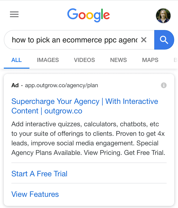
The headline caught my attention ‘Supercharge Your Agency.’ I decided to click on the ad as we are pouring more resources into producing content.
Their marketing funnel let them down.
It directs you straight to a 7-day free trial landing page. No information. Direct to sign up. 🤯
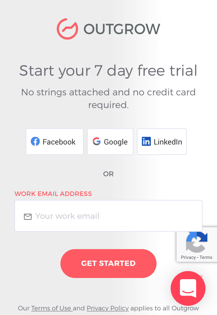
The landing page does not correlate to the ad copy I clicked on ‘Supercharge your agency.’
There was no additional information below the signup area.
The lack of information on the landing page lead me to click away.

We don’t want to be throwing money away like this. Source
CRO Takeaway: Make your landing page copy extremely relevant to your ad copy to add additional value to the conversion journey.
12. Use social proof pop-ups
People trust other people more than brands.
Make sure you’re not losing out on leads just because you haven’t provided them with social proof in the way they want it.
Create pop-ups that provide social proof.
The best part is: social proof served in pop-ups is incredibly effective.
LawnStarter uses social proof to show who recently booked a lawn service, including how many minutes ago.
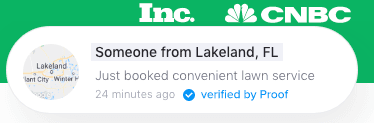
When your customers see that people are constantly taking action on your website (e.g. signing up or purchasing a service), they’ll be more inclined to think you’re the right business for their needs.
After you’ve convinced them, conversion becomes a piece of cake.
Are Your Ready to Improve Your Conversion Rate?
If you want to reduce your PPC costs and maximize your ROI while improving your lead quality, it’s time to take a look at your landing page.
Just a few tweaks and tests and you’ll be good to go!
Let us know in the comments below if you decided to implement any of these tweaks to your landing pages. We want to know!

Co-founder @ Hey Digital
About the author
Celia Hey is the co-founder of Hey Digital and Hey Design, where she focuses on helping SaaS companies scale through high-converting, performance-driven creative. She specialises in building creative systems at Hey Design that enable faster experimentation and measurable growth.
View LinkedIn
Blog

